

Typography that keeps you moving
Jindal Steel Works, BKC Mumbai
2024
Spatial Design · Environmental Graphics · Typography
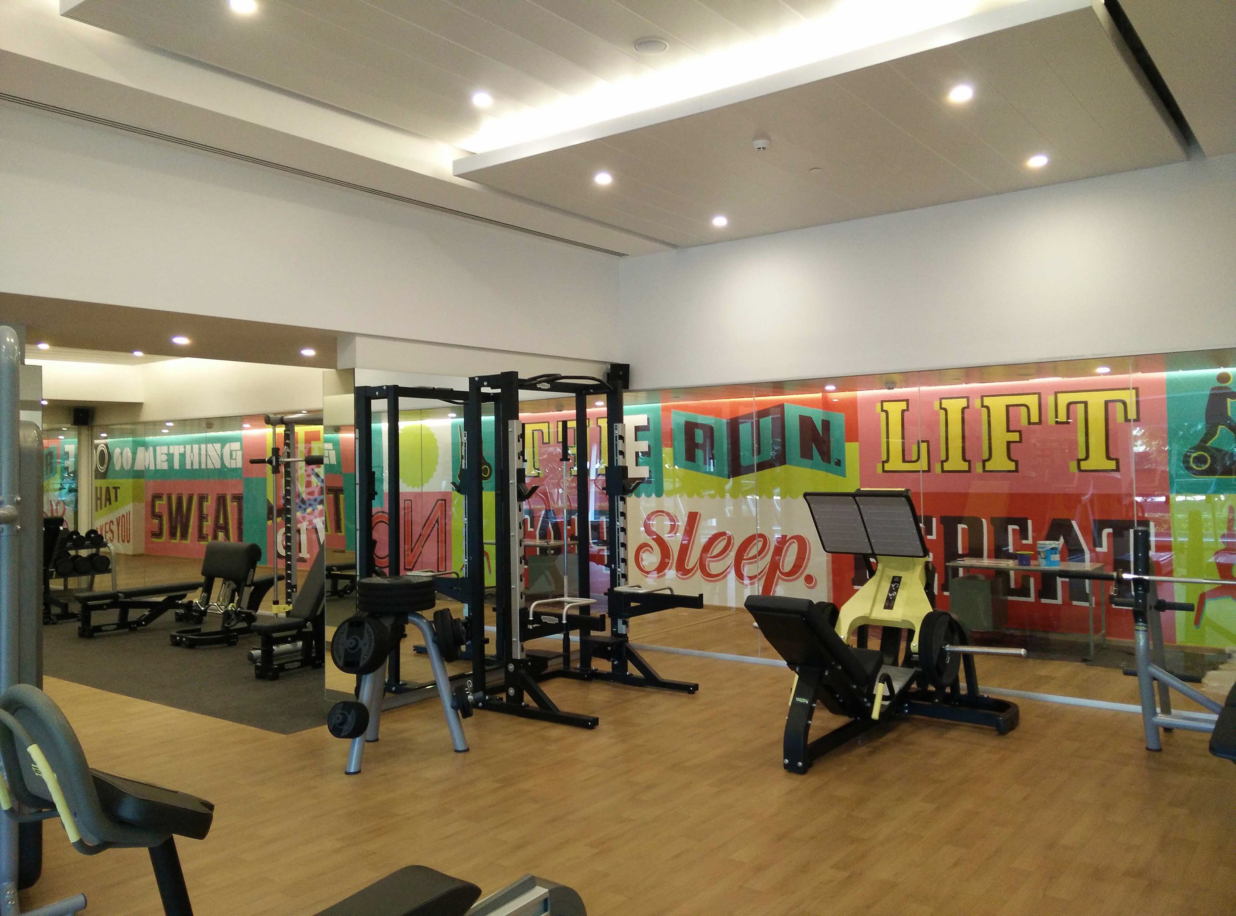
Recharge is a contemporary gym at Jindal Steel Works, BKC, designed as a space that feels energetic, focused and inviting. The project covered the reception, juice bar and environmental graphics, using typography and bold graphic interventions to give the space a distinct visual character.

Making typography part of the space
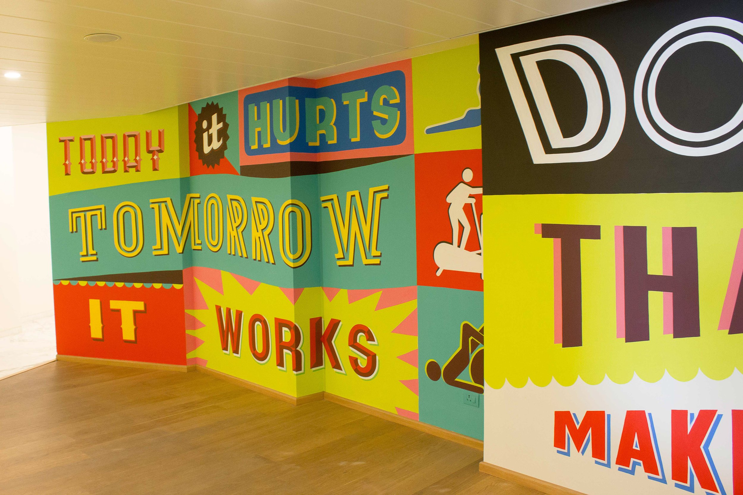
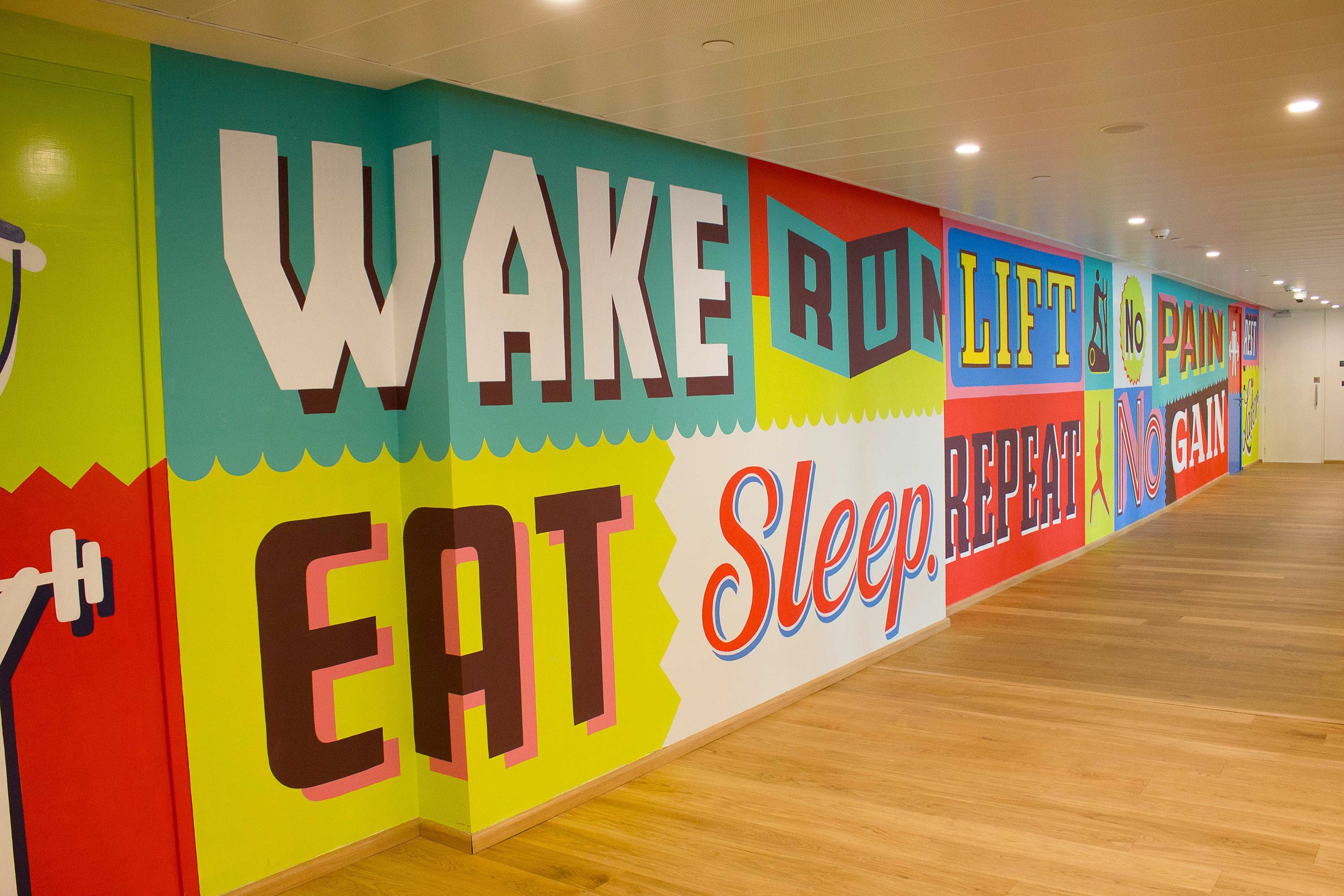
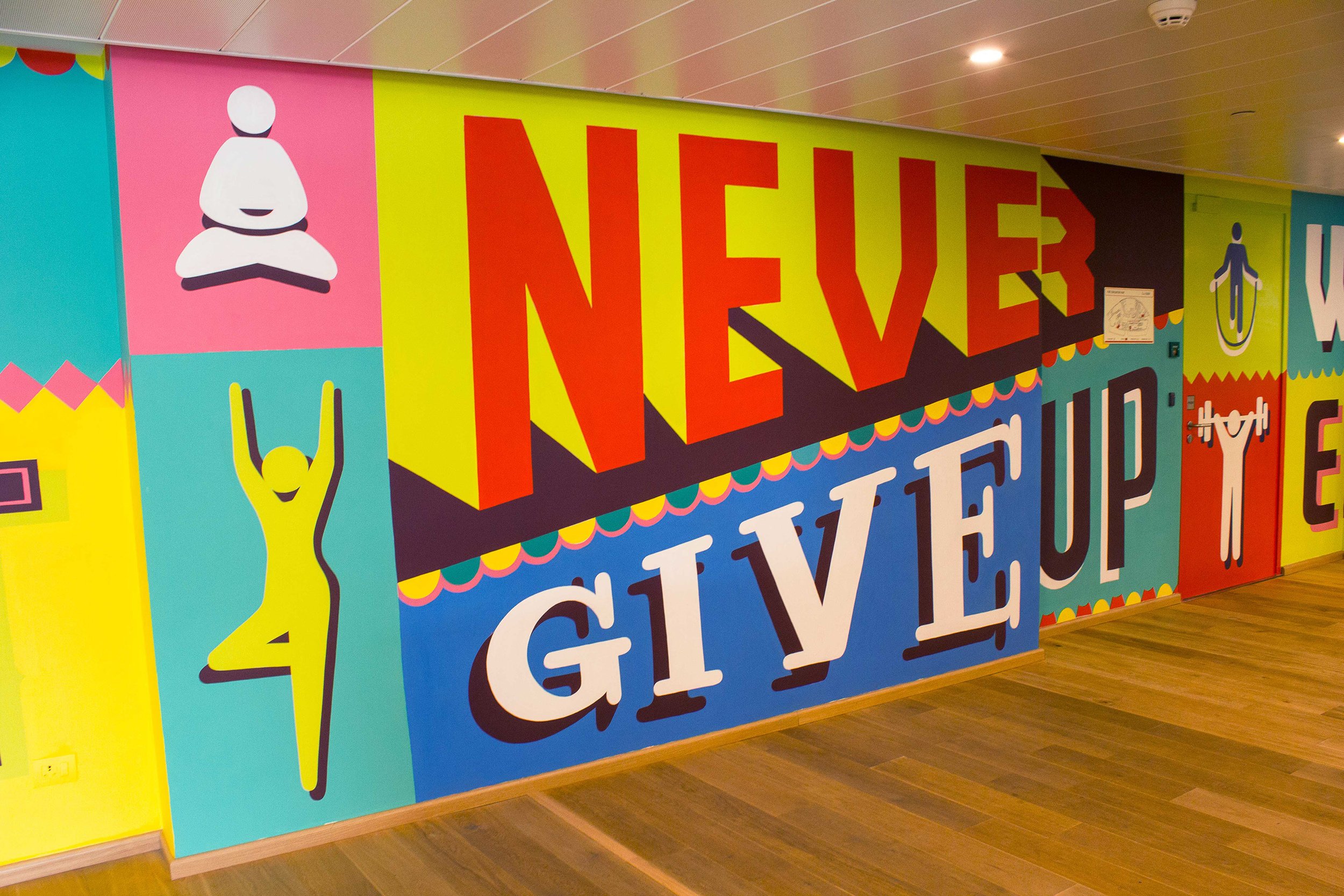
Typography became the central visual element, extending across walls and surfaces to create a bold and energetic environment. Large-scale words and graphic compositions were used not simply as decoration, but as part of the architecture of the space.

Rewind. Recharge. Go again.
The Recharge logo is built around two arrows that reference the idea of rewind. In the context of fitness, the gesture becomes a simple idea: pause, reset and come back stronger. This became the foundation for an identity that connects the act of recharging with the rhythm of working out.

Making motivation visible
Motivational words became a key part of the visual language. Large-scale typography was integrated into the environment to create moments of encouragement throughout the gym, turning the walls into an active part of the workout experience.


CLIENT
Jindal Steel Works
COLLABORATION
Guerrilla Art & Design Pvt. Ltd
CREATIVE DIRECTOR
Hanif Kureshi
DESIGNER
Akash Raj Halankar
PRODUCTION
Painter Kafeel & Co.